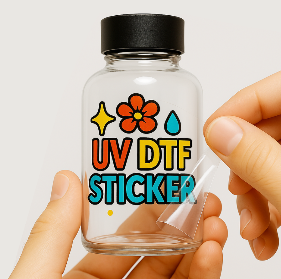
Creating an eye catching UV DTF sticker involves much more than designing an attractive graphic. Every design decision, from layout and typography to color selection and file preparation, influences how the final sticker looks after it is transferred onto a hard surface. A thoughtful approach helps ensure the finished product reflects the quality of the brand it represents.
Whether you are creating product labels, promotional decals, packaging graphics, or custom branding, preparing artwork correctly can save time, reduce revisions, and improve print results. Understanding the design process before submitting your files gives both designers and print providers the best chance of producing outstanding UV DTF stickers.
Plan Your Sticker Design Before Opening Design Software
Great sticker designs begin with planning rather than jumping straight into a design program. Businesses working with professional UV DTF printing often achieve better results because they organize their ideas before creating artwork.
Considering DTF durability during the design process also helps ensure the finished stickers remain vibrant and long-lasting while meeting both creative and practical expectations.
- Define the main purpose of the sticker.
- Identify where the sticker will be applied.
- Decide on the final dimensions before designing.
- Collect logos, fonts, and brand colors.
- Keep the message simple and focused.
- Consider how customers will view the finished sticker.
- Plan enough space for every design element.
Design Principles That Create Better UV DTF Stickers
Professional looking stickers are built on strong design fundamentals rather than complicated artwork. Applying a few proven design principles helps create stickers that attract attention while remaining clear, balanced, and easy to read.
-
Keep the Message Simple
Many designers try to include too much information within a limited space. Simple messaging allows viewers to understand the design immediately without searching through unnecessary text or graphics.
Focus on one primary idea for each sticker. Whether promoting a brand, displaying a logo, or labeling a product, keeping the message concise creates a stronger visual impact.
-
Build a Clear Visual Hierarchy
Every design should naturally guide the viewer’s eyes from the most important element to the least important one. Visual hierarchy helps organize information in a way that feels natural and easy to understand.
Larger logos, stronger headlines, and well positioned graphics create a smooth reading experience while making the design appear more professional and balanced.
-
Choose Fonts That Match Your Brand
Typography communicates personality just as much as colors and graphics. Brand appropriate fonts help reinforce the image you want customers to remember while improving overall consistency.
Avoid using multiple decorative fonts in one design. Combining one display font with one clean supporting font often produces a polished and readable layout.
-
Use Color with Purpose
Color influences how customers recognize and remember a brand. Strategic color choices create contrast, improve visibility, and help important elements stand out without overwhelming the design.
Instead of using every available color, build a limited palette that complements your logo and remains consistent across different products and marketing materials.
-
Design for the Application Surface
A sticker designed for a glass bottle may require a different layout than one intended for a wooden gift box or metal tumbler. Surface awareness helps designers create artwork that works well in real world applications.
Consider the shape, texture, and visible area before placing important graphics or text. Designing with the final surface in mind improves both appearance and usability.
-
Think About Viewing Distance
Not every sticker is viewed from the same distance. A product label is examined closely, while a promotional decal may need to attract attention from several feet away. Viewing distance should influence every design decision.
Increase text size, simplify graphics, and improve contrast whenever stickers need to remain readable from farther away. Small adjustments can significantly improve visibility without changing the overall design.
Common Design Decisions That Improve Print Results
Small design choices often have a bigger impact than complex effects or advanced tools. Paying attention to these details helps create UV DTF stickers that look polished, communicate clearly, and print accurately.
Leave Enough White Space
Many designers feel every part of the sticker should be filled with graphics or text. White space gives important elements room to stand out and makes the overall layout easier to understand.
A clean layout appears more professional and improves readability. It also prevents the design from feeling cluttered, especially on smaller stickers.
Avoid Using Low Quality Graphics
Copying images from websites or social media usually leads to disappointing print results. High quality artwork produces sharper details and cleaner edges on the finished sticker.
Whenever possible, use original vector graphics or high resolution images. This ensures logos, illustrations, and icons maintain their quality during printing.
Design for Different Sticker Sizes
A design that looks great at four inches may not work well at two inches. Scalable artwork allows the same design to remain effective across different sizes without losing clarity.
Before approving the artwork, view it at both large and small dimensions to confirm that text, icons, and spacing remain easy to recognize.
Keep Branding Consistent
Every sticker should reinforce your brand identity. Consistent branding helps customers recognize your business across products, packaging, and promotional materials.
Use the same logo placement, colors, fonts, and graphic style throughout your designs. A consistent appearance builds trust and creates a stronger brand image over time.
Review the Design from a Customer’s Perspective
Designers often focus on technical details while overlooking the user experience. Fresh perspective helps identify confusing layouts, unnecessary elements, or areas that need better balance.
Step away from the project before reviewing it again or ask someone else for feedback. A second opinion often catches issues that are easy to miss.
Request a Proof Before Final Production
Even well prepared artwork can benefit from one final review before printing. Proof approval gives designers an opportunity to confirm colors, positioning, and overall appearance.
Businesses ordering custom UV DTF transfers can avoid unnecessary revisions by reviewing a proof carefully before approving the final production run.
Preparing Your Final Artwork for Submission
Submitting organized artwork makes the production process faster and helps reduce avoidable revisions. A final review ensures your design is complete, accurate, and ready for professional printing.
- Verify the artwork matches the required dimensions.
- Confirm all images are high resolution.
- Convert fonts into outlines if required.
- Remove hidden or unused layers.
- Use clear and organized file names.
- Export the file in the preferred format.
- Double check spelling and alignment.
- Review colors one final time.
- Ensure logos and graphics are correctly positioned.
- Save a backup copy of the original editable file.
Conclusion
Designing print ready artwork for UV DTF stickers is about more than creating an attractive graphic. Careful planning, thoughtful design choices, and proper file preparation all contribute to a professional final product. By following these best practices, businesses and designers can produce high quality stickers that strengthen branding, reduce production issues, and deliver outstanding results on a wide variety of hard surfaces.