Instagram Unveils First Logo Redesign in a Decade: Modern Refresh or “Blanding”?
the staff of the Ridgewood blog
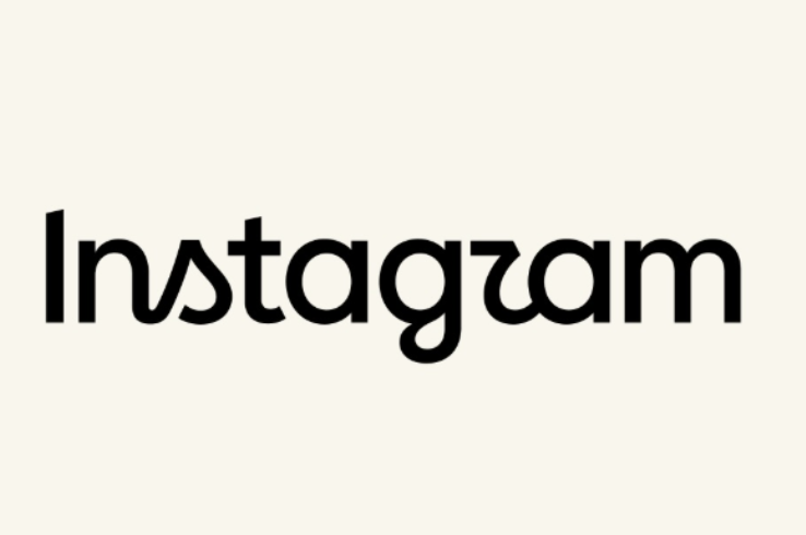
Ridgewood NJ, For the first time in ten years, Instagram has officially updated its iconic text wordmark. Revealed by Instagram head Adam Mosseri, the refreshed typeface moves away from the app’s classic 2010 cursive-only design, introducing a wider style that blends sans serif and cursive lettering.
While Meta describes the redesign as a cleaner, more modern look that honors the platform’s original identity, the updated logo has already sparked widespread debate online.
“Instagzam?” The Internet Reacts to the New Typeface
Shortly after the reveal, users and designers across Threads, X (formerly Twitter), and Instagram began poking fun at the typography. Many pointed out that the stylized letters can easily be misread:
-
Letter Confusion: Critics noted the updated “r” resembles a “z” or “u,” leading some to jokingly read the logo as “Instagzam” or “Instagwam.”
-
Readability Concerns: Others questioned whether the lower-contrast, custom font passes standard digital accessibility checks for readability.
-
Platform Priorities: Several creators expressed frustration that Instagram focused on aesthetic updates while users continue to push for better account support and filters for AI-generated content.
Despite the hot takes, design commentators noted that the shift keeps the logo fresh while maintaining recognizable ties to the original brand.
The Rise of “Blanding”: Why Cursive Logos Are Disappearing
Instagram’s update reflects a broader movement across corporate branding often described as “blanding”—a trend toward simplified, sans serif, and minimalist typography.
In recent years, legacy companies like Johnson & Johnson and Eddie Bauer have also retired long-standing cursive logos in favor of cleaner, modern sans serif fonts.
The Risks of Rebranding
While refreshing a visual identity keeps a brand looking relevant, subtle changes can carry risks:
-
Brand Loyalty: Research into brand redesigns shows that altering key visual identifiers can alienate long-term users—with drastic color changes often impacting fan loyalty even more than shape modifications.
-
Minimalist Fatigue: As more tech and retail giants simplify their imagery, critics argue that corporate logos are losing their unique personality and charm.
Fortunately for Instagram fans, the vibrant, multi-hued camera icon app symbol remains unchanged.
Tell your story #TheRidgewoodblog , #Indpendentnews, #information, #advertise, #guestpost, #affiliatemarketing,#NorthJersey, #NJ , #News, #localnews, #bergencounty, #sponsoredpost, #SponsoredContent, #contentplacement , #linkplacement, Email: [email protected]
-
Tags & Keywords:
Instagram,Tech News,Graphic Design,Rebranding,Social Media Trends,Meta